I have a lot of fun making storyboards for my blog, so I thought I’d write up a tutorial to share! These are a great way to share your images in a fun way, and lend context to tell the story behind the photographs!
TIP: Storyboards look more pleasing when the images are all edited in a similar style — so try not to mix black and whites with colour images, or bright and sassy with muted vintage. Colour harmony is your friend!
Here is the Photoshop edition I used (Creative Suite 4).

Now to create a new document. In the top menu, go to FILE >> NEW and plug in the size you want your document. The larger you make your document, the more images you can fit into it, and the larger you can make those images. I have 5 images here, and I want them fairly large (I like to go big!) so mine will be 16×20 inches. These are just for the internet, so I’ll just set resolution to 72 ppi. You can also choose to make your document a specific size, such as the width of your website or blog. I like to use inches, and then resize for blog afterwards.

Now to start making shapes or squares in which to place your images. In the top menu, select New >> Layer. You can use any shape you want, with the tools. I usually just do squares, because I like the uniformity, so I use the rectangular marquee tool. You can leave a small width of white around the edges to act as a frame if you like (which you can then change the colour of with the paint bucket tool!)
You can hit “U” to bring up the shapes palette, and choose a new shape, like star or oval, or rounded rectangle if you want more creative shapes.
After the shape is created, use the paint bucket tool to colour your shape (any colour will do).

Now you can continue to make shapes, as many as you wish as will fit onto your document. Simply select New >> Layer and use any tool to create your shape, and fill in the shape with your solid colour. Be playful and creative! They don’t have to line up exactly. Mix squares with rectangles, four squares in the corners with a star in the middle, whatever look you are going for!
Here is my finished document, with my five shapes. As you can see in the Layers palette on the left side, each of my shapes are located on their own layer. You can name these layers if you want, or even group them into “Top Images” and “Bottom Images”, however you want to organize them. This is helpful for when you want to reuse the PSD template again for future storyboards.

TIP: If your shapes are not sitting exactly as you want them to (not lined up right, not enough space left around the edges, etc) don’t worry! Fill them in, then use the Move tool to shuffle them around a bit. Hit CNTL + T to transform them to fit a little better, pushing or pulling them from the corners to make them bigger or smaller, from the edges to make them fatter or taller. You can also make use of the grids, to make sure the shapes are lined up along the sides.
Now to put your images into the “holes”!
On your document, highlight the Layer you will be pasting it onto and choose FILE from the top menu, and PLACE. This takes you to your computer folders, so you can choose which image to insert. Your image will pop up, probably in the middle of the document. Don’t worry! We still have to make it fit.

To make the image fit nicely into the slot, hit CNTL + T to transform it. Move it on top of the shape, and *** VERY IMPORTANT *** hold down the shift key while pulling and pushing from the corners only. This will prevent warping. You can move it around from the middle to make it sit better, but if you are enlarging or resizing it down, always use the shift key while adjusting the corners. Allow it to go over the frame of the shape just a bit, to make sure none of the black background will be visible. Then hit the green checkmark above. And also, very importantly, go into the Layers palette and hit the drop down menu on the top right side and choose “Create Clipping Mask” This will make your image drop right in, neatly!
TIP: you can create a slot for the images in advance, complete with clipping masks if you choose. Choose a layer, and hit CNTL + SHIFT + N to create a new layer. Name it “Insert Image Here” or “Top Left Image”, whatever you wish, and choose “Create Clipping Mask”. Now you have a ready made slot for Placing images, already clipped to the window below. Follow the same CNTL + T instructions above to size it. This saves you some clicking the next time you use the template!
Now go select each of your images, and repeat the process! Make sure to paste your image onto the right layer. I don’t worry too much about a bit of elbow chop if you have to do so in order to make them fit into the slot. My finished storyboard now looks like this:

TIP: Your storyboard will look and flow more nicely if you “compose” the storyboard. Have it read in such a way that keeps the viewer interested and that also makes sense. For example, if the subject is facing right, put the image on the left, and vice versa. This will “bookend” the board, and prevent it from looking like your subject is looking out of the board.
Now to save it! Save as a PSD if you want to use the storyboard again. Flatten and save if you want to keep it as a full size JPEG. I always save 2 copies, one full resolution JPEG and one for the blog. Because I use images that have not yet been sharpened, I flatten the storyboard, then run my own resize/sharpen/watermark action, which also changes the profile to sRGB if the images I’m using are files that I’ve just exported from LR into PS as ProPhoto 16 bit files.
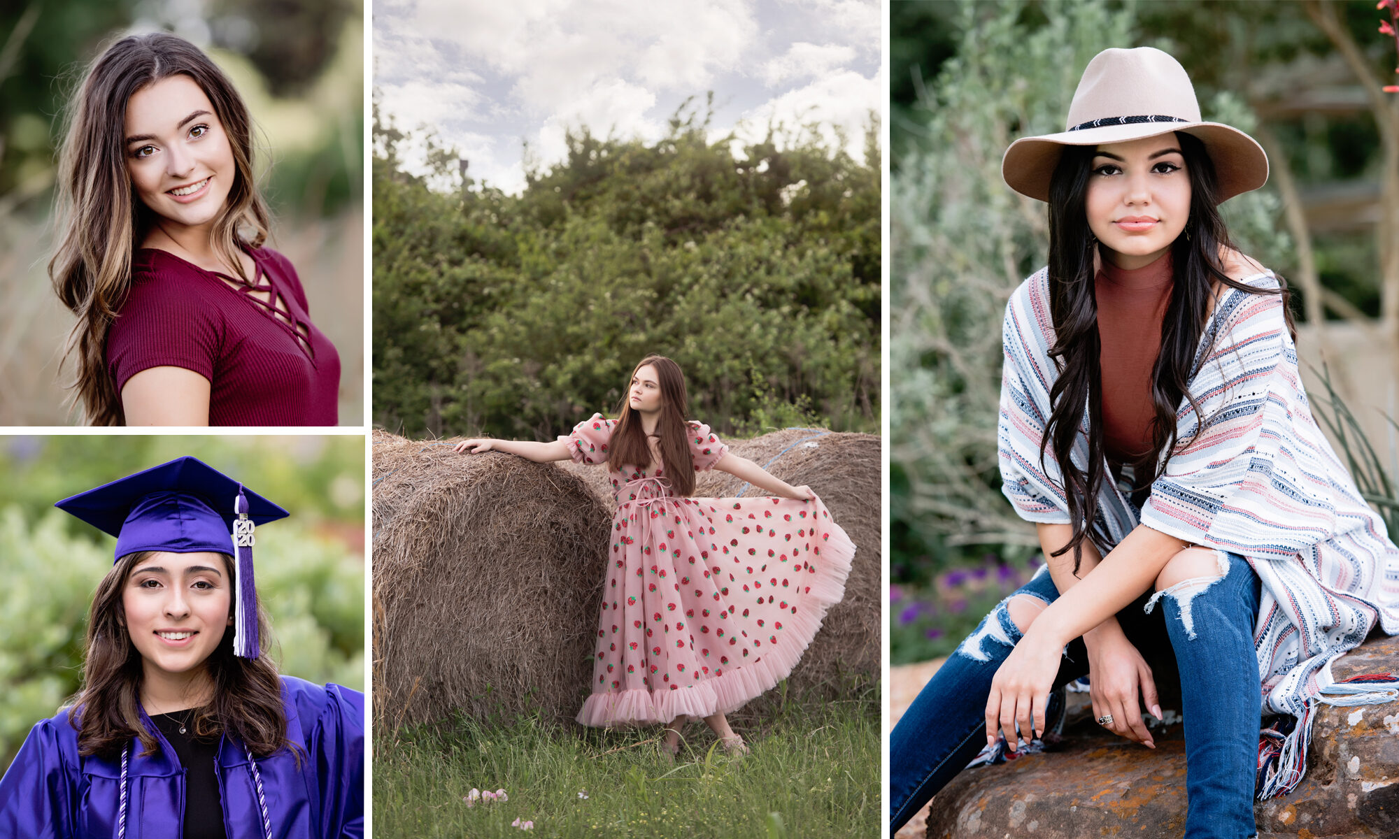
And here it is! My final storyboard, ready for blogging!
 If you prefer, you can also use the paint bucket to fill in some of the shapes with a new colour instead of an image, and use the TEXT tool to add a poem, the name of the subject, the date, etc.